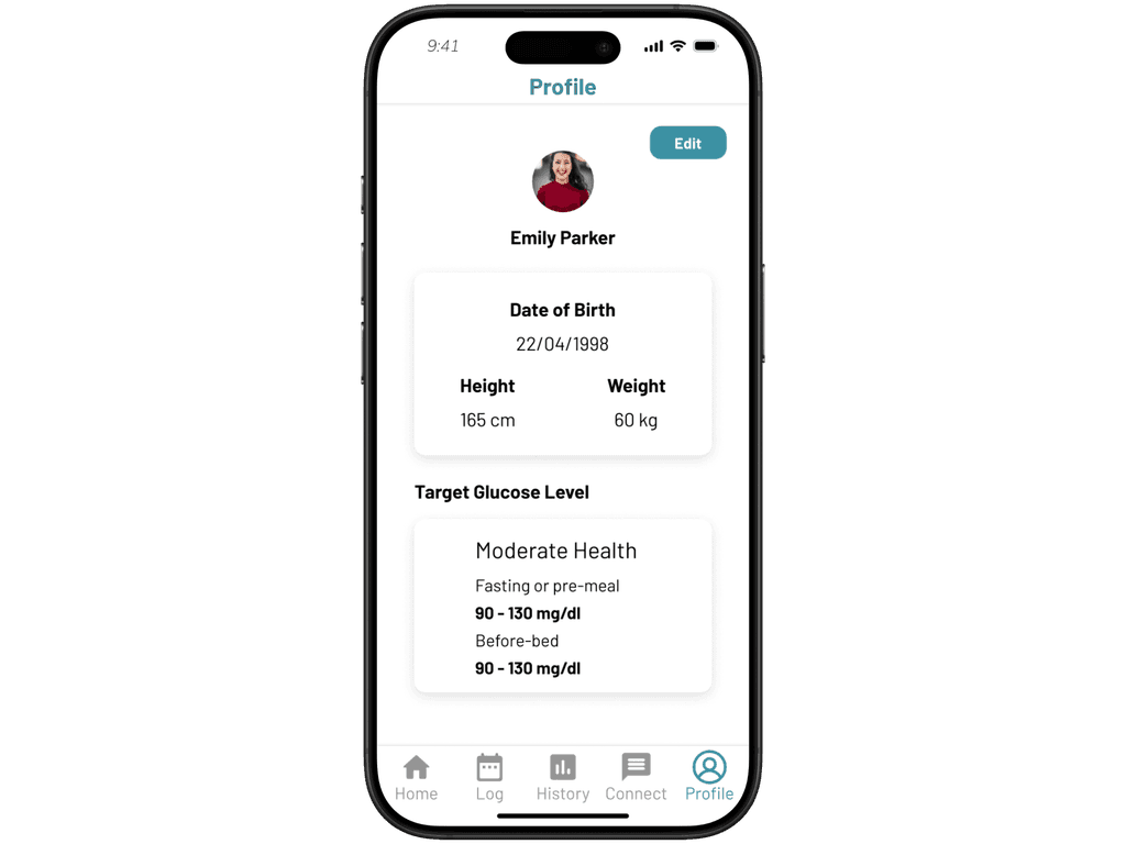
Based on the collected data, while there is a growing trend of younger individuals being diagnosed with diabetes, the majority of cases still occur among the elderly. Therefore, this project prioritizes elderly users as the primary target group.
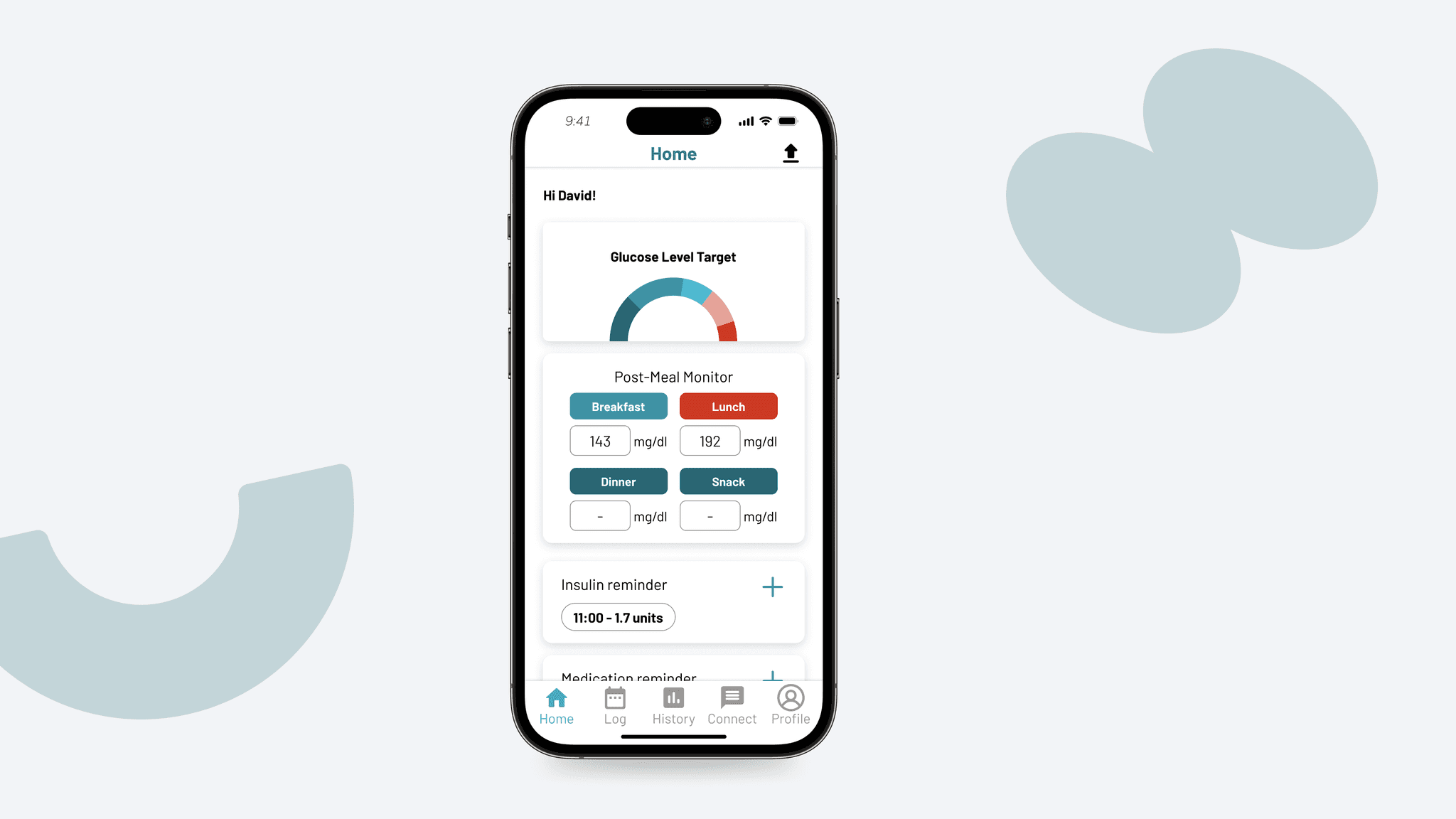
To ensure the interface is both accessible and appealing to elderly users, we place special emphasis on text and icon sizing. All text is set to a minimum of 18px for readability, and icons are enlarged to at least 36×36px to support easy interaction.
For color usage, we adopt a pre-dominantly black, white, and grayscale palette to create visual clarity and reduce cognitive load. Primary colors are used sparingly and purposefully—such as drawing attention to key actions like buttons or navigation cues—so they serve a clear functional role in guiding user interaction.